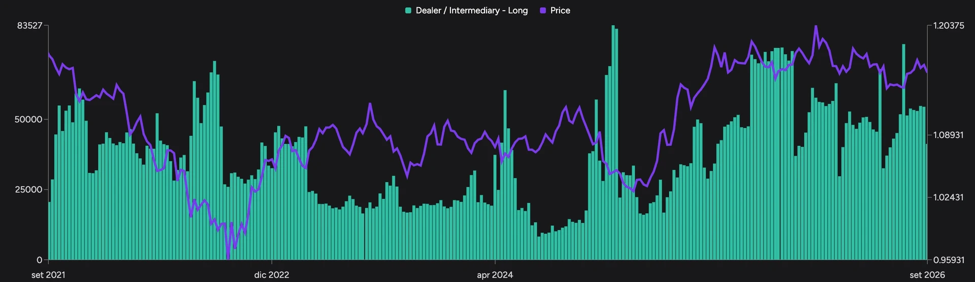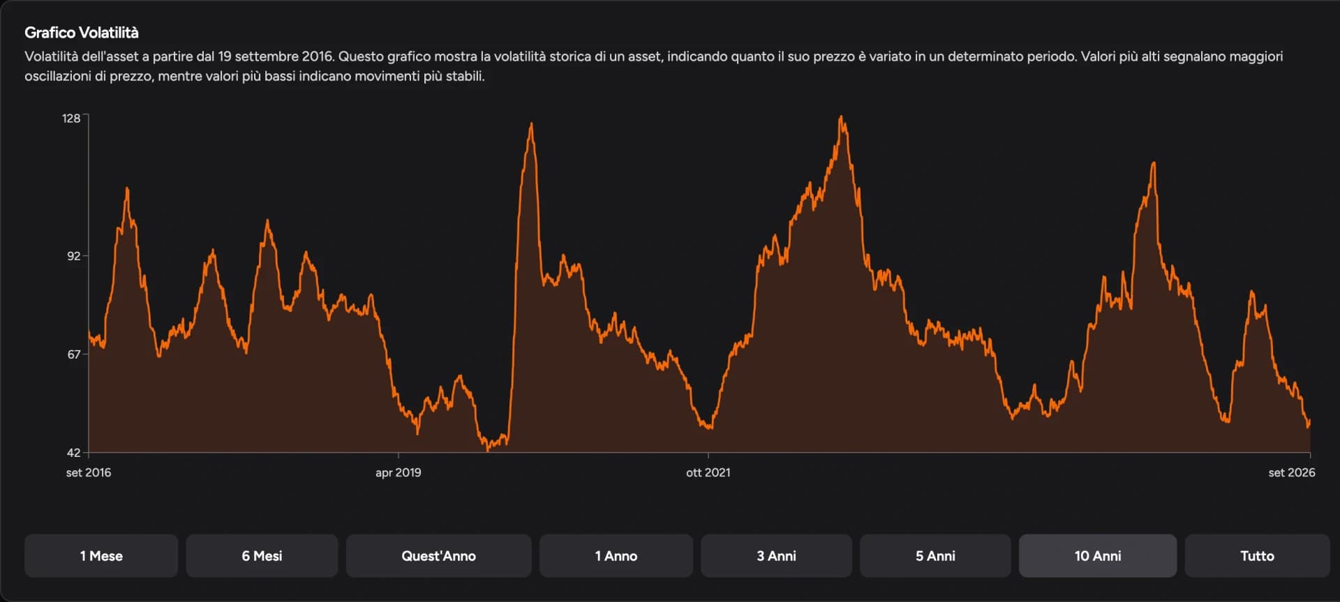
Screenshots show the Italian app interface; controls are explained in the language of this guide.
DeepView's seasonality view lets you compare how an asset behaved across different years and drill into a period with Trade Statistics. You look for a historically bullish or bearish phase, choose the dates and check how consistent the results were. This guide follows EUR/USD from the chart controls to the yearly table. For the reading principles behind it (averages, median, choice of years), see seasonality in trading.
Open the page: EUR/USD seasonality in DeepView
1. Find the market and open Seasonality
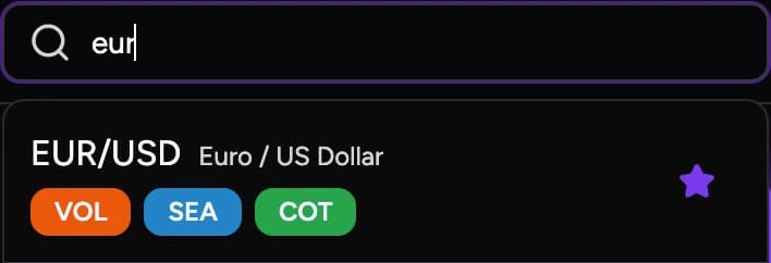
Open DeepView from the side menu. In the asset search field, type the instrument's symbol or name: searching "EUR" brings up EUR/USD. The tags next to each asset show which analyses are available: SEA for seasonality, VOL for volatility, COT for positioning data. Once you've picked the instrument, click Seasonality under its name.
The page holds the curve chart, controls for years and filters, and the statistics for the selected window.
2. Choose the curves to compare
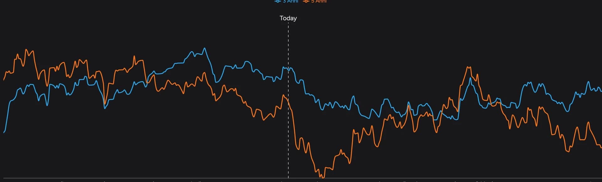
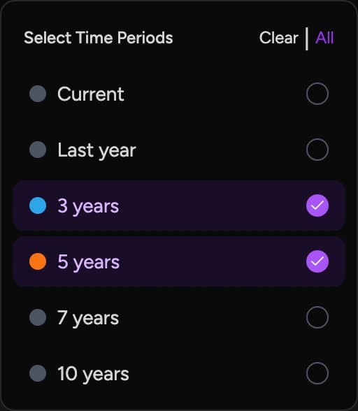
Open Periods. For EUR/USD you'll find Current (this year), Last year and the 3-, 5-, 7- and 10-year series. You can enable several at once; Clear resets the selection and All turns everything on. The legend maps colors to curves.
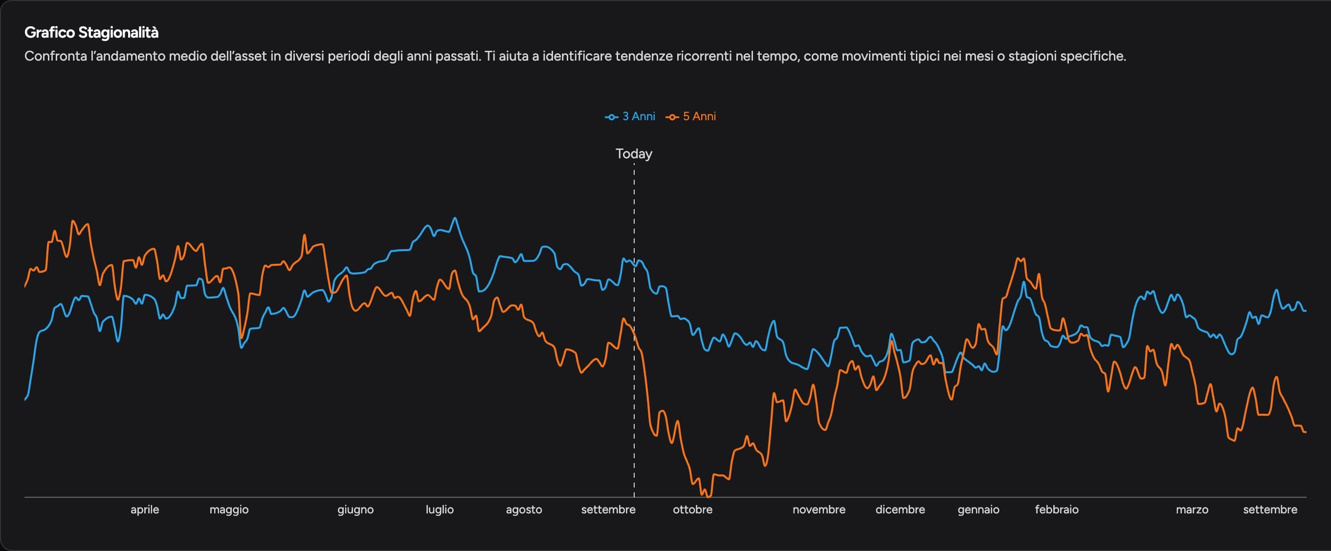
A good starting point is comparing 3 and 5 years. If the stretch points the same way, the two averages agree; if it changes, the extra years are shifting the result. Remember they overlap, so they aren't two independent samples.
Adding Current shows whether this year's seasonal move is playing out, arrived early, or isn't showing up in price at all.
3. Spot the period worth studying
Follow the curve along the calendar: a rising stretch means an average bullish move, a falling one an average bearish move. What matters is the direction between your dates, not whether the curve sits high or low. A curve that's already high may have started falling, and a bullish stretch can contain pullbacks.
Below the chart is the Correlations panel, which measures how similar the compared paths are. To see how often a long or short trade worked in the period, use Trade Statistics instead (step 6).
4. Compare the chart with and without COVID
The biohazard button turns on Exclude COVID-19 Period, which removes 20 February to 20 April 2020; click again to turn it off.
Keep the same years and switch between the full and filtered view. If the stretch changes a lot, those weeks weigh heavily on the average. The filter only applies when the selected years include those dates, and it doesn't remove all of 2020.

5. Use Detrending Mode
The sloped-line button turns on Detrending Mode, which strips out the long-term trend to make seasonal swings easier to see. On an asset that has risen for years, the overall trend can inflate the curve's slope. The comparison shows where the move speeds up, slows down or reverses relative to that trend.
Detrending and the COVID filter do different jobs: one acts on the trend, the other removes a date range. Use the transformed view to study the period, then return to actual price when you assess a trade.
6. Select the dates and direction
Click Select a date and pick the start day, then the end day, in the calendar. The button shows the window, for example "Sep 01 - Sep 15". Scroll down to Trade Statistics and choose Long or Short.
In the EUR/USD example, window 1–15 September, direction Long:
| Horizon | Share of favorable results |
|---|---|
| 3 years | 66.7% |
| 5 years | 40% |
Adding years changes how the same window looks. The table shows Start Date, End Date and prices for each row. Those are the actual dates behind each result and can differ from the ones you picked in the calendar.
7. Read returns and excursions
- Return %: the result for each occurrence.
- Max Drop % and Max Rise %: the adverse and favorable excursions during the window.
In the example's 2025 row: Return +0.41%, Max Drop −0.64%, Max Rise +0.83%. The final result is positive, but price moved more than half a percent against the position along the way. With a stop inside that excursion, the trade would have ended very differently from a simple start-to-end comparison.
Pattern Returns shows results year by year; the Returns panel shows Average Return and Median Return. In the 5-year example there are 2 positive and 3 negative results, with an average of −0.39% and a median of −0.05%. The average is pulled by the larger results; the median is the middle value. Gains, Losses and Total Trades give the counts.
Annualized Return expresses the result on a yearly basis. To judge the weeks you selected, start from the period return and the table instead.

8. Bring the window into your trading
A historically bullish phase can lead you to look for long setups in that asset during those weeks. Wait for your setup, place the stop on the trade's levels and use the end of the window as one management reference, alongside targets and market structure.
Round out the picture with the COT Report for positioning and volatility for the size of moves. Then practice the same windows from past years in the Backtester and compare management approaches with the Backtest Simulator.
FAQ
Why can the 3- and 5-year curves point in different directions?
The 5-year average includes two more years. If those years moved differently, they change the direction of the stretch. The yearly table shows which results make the difference.
Is a long window the same as buying and waiting for the end date?
The statistics measure the selected range from start to finish. In your trading the window is context for finding an entry: stops, partials and early exits produce a different result from the start-to-end comparison.
What do the SEA, VOL and COT tags mean?
They show the analyses available for the asset: seasonality, volatility and the COT Report.
For information and education only, not financial advice. Past results do not guarantee future performance. Leveraged trading carries a high risk of loss.