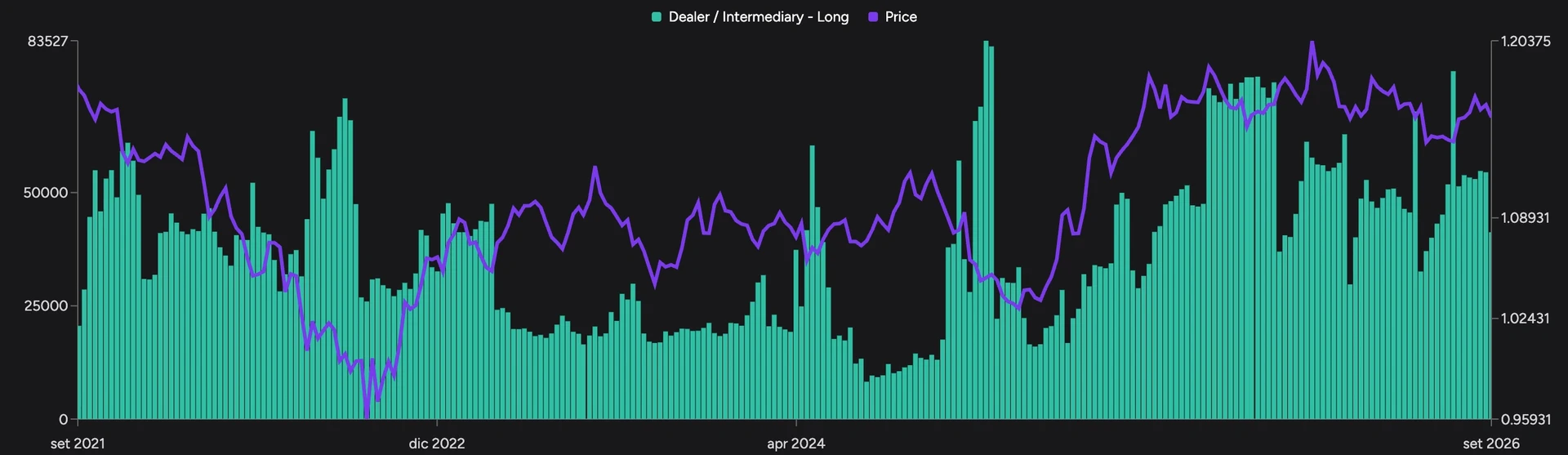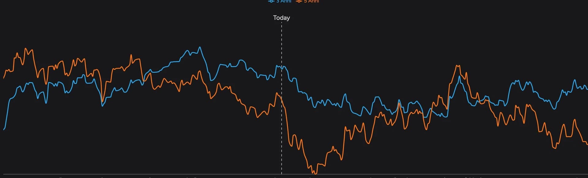
Screenshots show the Italian app interface; controls are explained in the language of this guide.
DeepView shows how an asset's volatility changes over time and how it's distributed across weekdays and hours of the day. It helps you find the busiest windows and compare them with the hours and management of your strategy. This guide uses EUR/USD. For the basics (sessions, volatility measures, the link with stops and size), see forex volatility and trading session times.
Open the page: EUR/USD volatility in DeepView
1. Open the volatility history
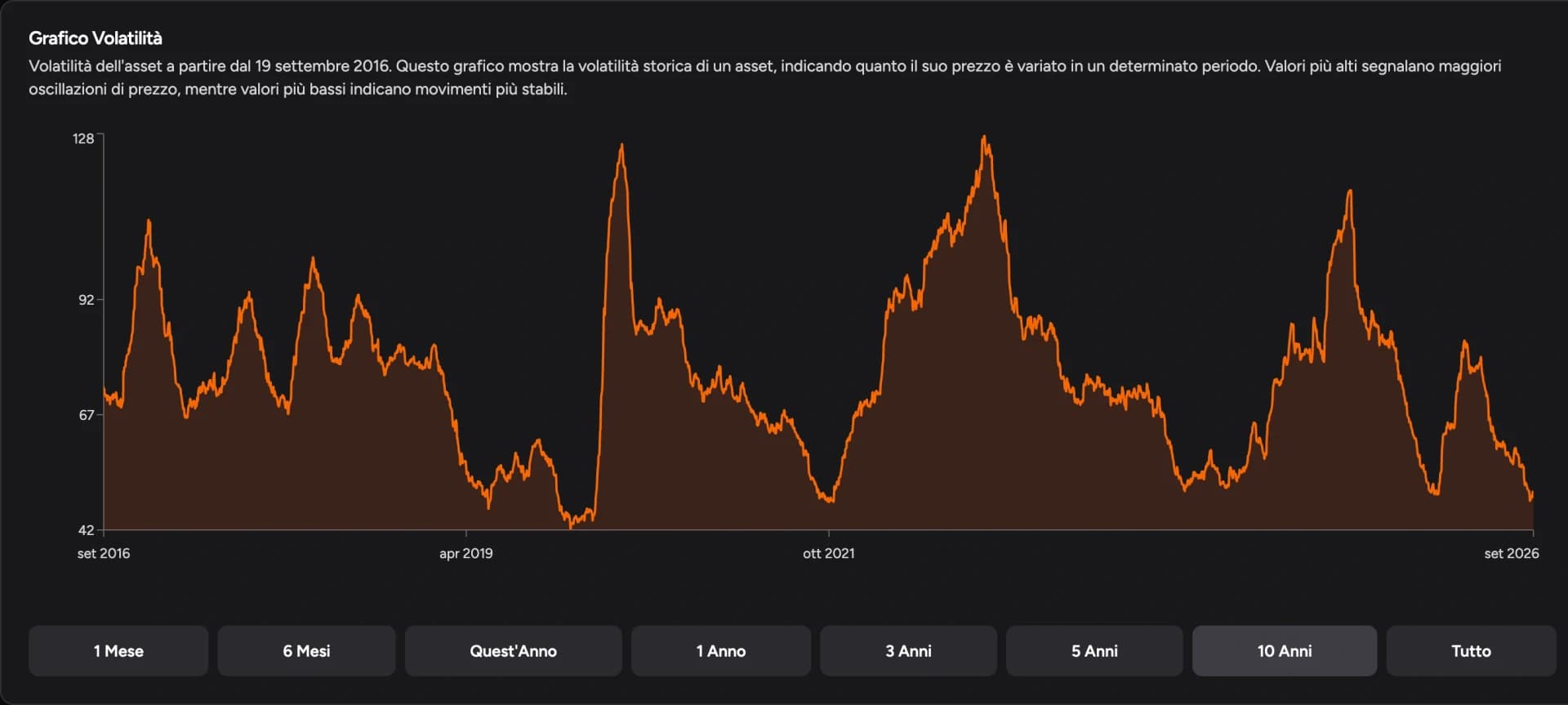
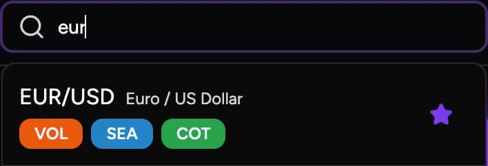
Search for the instrument in the top-right field of DeepView and select it; the VOL tag means the analysis is available. Open Volatility under the asset name.
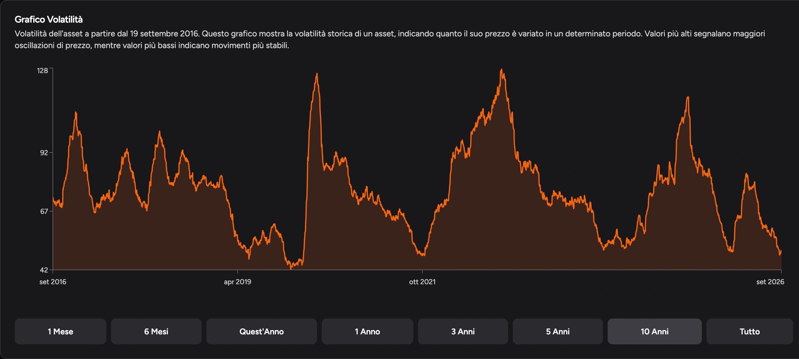
The historical chart shows how the size of moves has changed; the buttons below it widen or narrow the view. It's useful when you notice the market has changed pace: you can check whether the larger (or smaller) moves of recent days are part of a shift that has lasted for weeks.
Watch the units shown in the panel: pips, points and percentages aren't the same measure.
2. Set the averaging period
The Period control combines a number with a time unit. Selecting 10 and Weeks gives 10 weeks, or 70 days: that's the sample the weekday and hourly summaries are based on.
- A short period describes the last few weeks.
- A longer one adds more days and shows whether the distribution of activity holds up.
Don't look for one setting that works forever. Comparing two lengths tells you how much recent conditions differ from the broader picture.
3. Read the weekday summary
The daily chart compares the average size of moves across weekdays. A taller bar means more volatility in the measure shown, not a bias toward rallies.
Use it to see whether activity in the period clusters on certain days and to compare the size of moves with what your trades need.
The economic calendar is separate information: a major release can change tomorrow's conditions even if that weekday's historical average is low. Volatility describes what happened; scheduled events help you prepare for what's coming.
4. Compare hours of the day
The hourly summary shows where movement concentrates and how long the busiest phase lasts. In the guide's screenshot the time zone is Europe/Rome, so read the hours in that reference.
To study the US session, look at the windows around the New York open and the ones after it: the average may rise at first and then fade, or stay high for several hours.
If you compare the panel with a chart or account in another time zone, check the actual time. Europe and the US switch daylight saving in different weeks, so a fixed offset isn't right for every date.
5. Compare volatility with your results
- Targets. The hourly average helps you judge how big the move you're aiming for is, but it's neither a market limit nor a level to exit at automatically.
- Stops. If the level that invalidates the trade is further away, position size determines how much you risk over that distance. At the same size, a wider stop means a larger potential loss.
- Results. In the Journal, open P&L per Hour, select Open to group trades by entry hour and use the same time zone as the volatility panel. Our guide to analyzing your trading journal walks through it.
You may find that the busiest window isn't the one where you get your best results. Opening the trades shows whether it's down to the setup, the management or the execution. In the Backtester you can then work on those situations in replay without waiting for a new live session.
To round out your preparation, add seasonality for the time of year.
FAQ
Does the tallest hourly bar mark the best time to enter?
It marks the window with the highest average in the selected period. Entry quality depends on the setup, so compare that window with your own trade results.
Why do the averages change when I add more weeks?
More days enter the calculation. If they had different moves or hourly patterns, the summary values change too.
What time zone are the hours in?
In the guide's screenshot, Europe/Rome. Check the time zone shown in the panel before comparing with your platform.
For information and education only, not financial advice. Leveraged trading carries a high risk of loss.